Overview
Finding a larger group of donors for homeless animals from the shelter in Gdańsk.
Project implemented as part of the mentoring program DareIT.
Intro
Application assumptions:
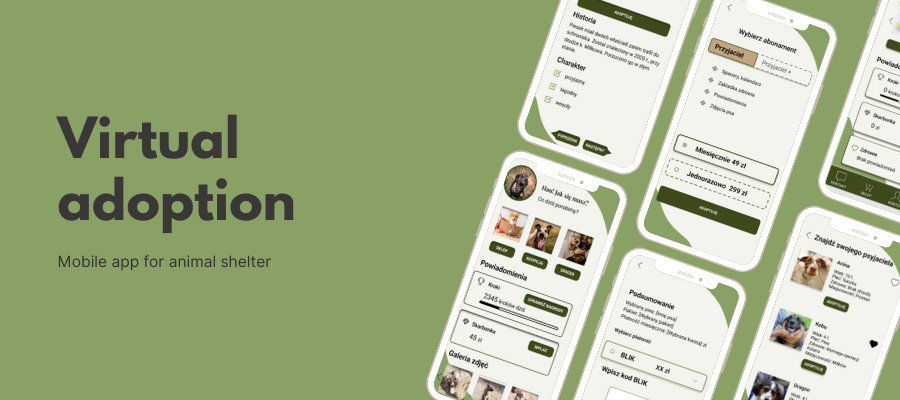
- Ability to select a pet from the list
- Selection of the amount of the monthly subscription
- Regular updates on the condition of an adopted pet
- Opportunity to buy things as a special food, blankets, leashes, textiles, etc.
- Data of the adopter
- Subscription end date reminder
- Proposal to start a new adoption
Challenging
- Value proposition for donors to motivate them to generosity
- Ongoing contact between the shelter and the donor
Goals
Create a user-friendly, collaborative app to virtual dog adoption.
My role
UX & UI | IA designer | IxD | Researcher
Deliverables
User Research, Competitor Analysis, Trends, Personas, CJM, User stories, User Flow, Sketches, Lo-Fi & Med-FI Wireframes, Interaction Map, Interactive Prototype, User Testing
Tools
Whiteboard, Pen and Paper, Figma, Miro, Google Meet, Google Key Word Planner, Google Trends, Semstorm
🛟Problem
Shelters are full of homeless animals. Not all pets can be provided with a new home, but they can be improved by supporting donors. Many people love animals and would like to help them constantly, but for various reasons they do not do it.
In that case, I emphasized identifying the reasons and motivations of the virtual owners for the contribution.
♥️Empathy map
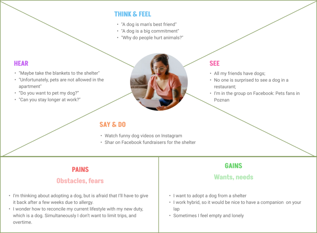
Our persona is a person who is not indifferent to the fate of abandoned and stray dogs. However, for some reason, he or she cannot adopt a pet. On the other hand, he or she willingly supports financial actions that help animals. He or she can’t afford to spend too much time looking for rebounds. Sometimes our persona feels the need to share good deeds with friends. He or she needs recognition for actions on behalf of animals. This is a person familiar with technology and using mobile applications.
Reasons why they can’t adopt a dog:
- dander allergy
- no own apartment/house
- reluctance to take on new responsibilities
- lack of acceptance from roommates/partners
- already has too many pets
- he or she can’t afford a dog
- there is not enough free time to devote to grooming and caring for the dog
🎁Value proposition canvas
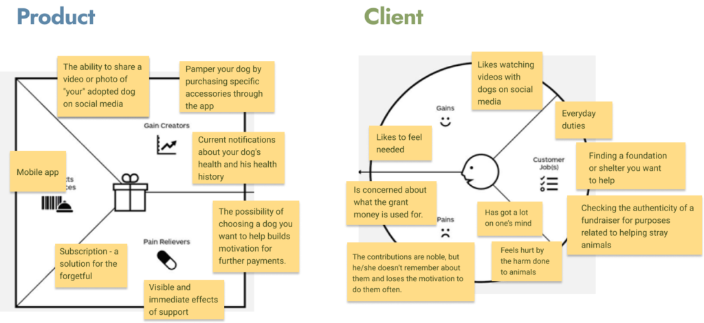
Application will allow a person interested in adoption to help any pet by virtual adoption and payment of money instead of personal help at the shelter.
🔎Benchmark
Conclusions
My application will have a slightly different character than the current solutions. Firstly, it aims to establish a bond between the owner and pet. The app goal is to keep up to date owner with his/her pet. Regular notification could nudge owner to check how the pet is doing.
Second, I focused on long-term support, rather than a one-time payment. Usually, the payment means the end of contact with the donor. On the other hand, the user quickly forgets about his help. Making a donation is now so easy that it may not even give you the satisfaction of a good deed. Therefore, this application, after the payment, will give you gratification. Positive associations will encourage him or her to make regular payments.
These ideas are worth verifying at a later stage, e.g. during a conversation with potential recipients.
During testing I especially check:
- steps to adoption
- payment method
- subscription model
- notification before/after adoption
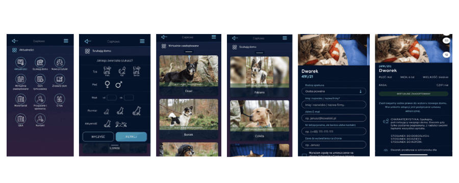
Ciapkowo – The application for virtual adoption
❤️ What I like?
- A lot of pet pictures
- Call To Action – buttons encouraging to perform an action
- Replacing some texts with icons to gain readability
- Adding a dog to favorites
- A detailed description of the pet
- A kind reminder about donation
- Sharing photos and the profile of the pet on social media
- Swipe sideways or click on the navigation to view another dog’s profile, without returning to the category page
- Active buttons, enabling direct calling and sending an e-mail without the need to copy data
- Q&A section
- Happy stories showing already adopted pets
- Subtle highlights of the last activity
👎 What I disliked or what was missing?
- White letters on a black background – it loses readability on a small screen
- Too much text
- Hard-to-find items
- Photos in different sizes and orientation
🪞What was common?
- Nice and big photos
- Good searcher with filters
- A detailed description on the dog’s or person’s profile
- Easy navigation (arrows, exit, menu)
- Access to the application without a user account
📋IDI interview
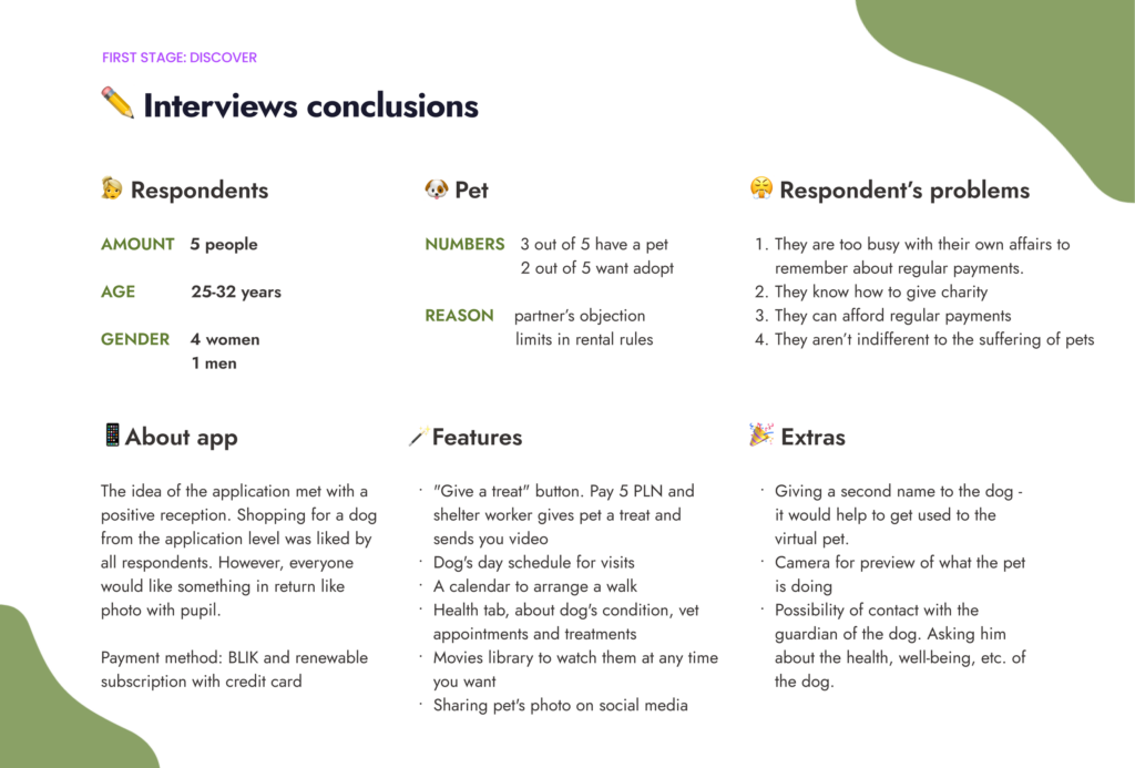
After getting acquainted with the problems of the selected target group, it’s time to define the problem for which I am looking for a solution.
🗝 Interviews conclusions
<span data-metadata="" style="caret-color: rgb(0, 0, 0); color: rgb(0, 0, 0); font-weight: 400; white-space-collapse: collapse; text-size-adjust: auto;"><span data-buffer="" style="caret-color: rgb(0, 0, 0); color: rgb(0, 0, 0); font-weight: 400; white-space-collapse: collapse; text-size-adjust: auto;">📒User stories
After getting acquainted with the problems of the selected target group, it’s time to define the problem for which I am looking for a solution.
User stories should be a clear message of the user’s needs, which we want to respond to with our solution. This is helpful to look at important points from the user’s perspective. What should you pay attention to so that the application is willingly used?
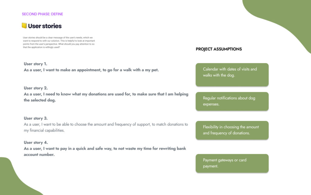
User story 1.
As a user, I want to make an appointment, to go for a walk with a my pet.
Design assumptions 1.
Calendar with dates of visits and walks with the dog.
User story 2.
As a user, I need to know what my donations are used for,
to make sure that I am helping the selected dog.
Design assumptions 2.
Regular notifications about dog expenses.
User story 3.
As a user, I want to be able to choose the amount and frequency of support, to match donations
to my financial capabilities.
Design assumptions 3.
Flexibility in choosing the amount and frequency of donations.
User story 4.
As a user, I want to pay in a quick and safe way,
to not waste my time for rewriting bank account number.
Design assumptions 4.
Payment gateways or card payment.
🗺Architecture information
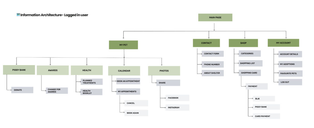
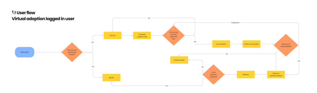
Based on findings that I learned during the research phase, I defined the key tasks, explored the app’s logic. That lead me to create a base user flow and navigation structure for the application.
<span data-metadata="" style="caret-color: rgb(0, 0, 0); color: rgb(0, 0, 0); font-weight: 400; white-space-collapse: collapse; text-size-adjust: auto;">🪂Customer journey map
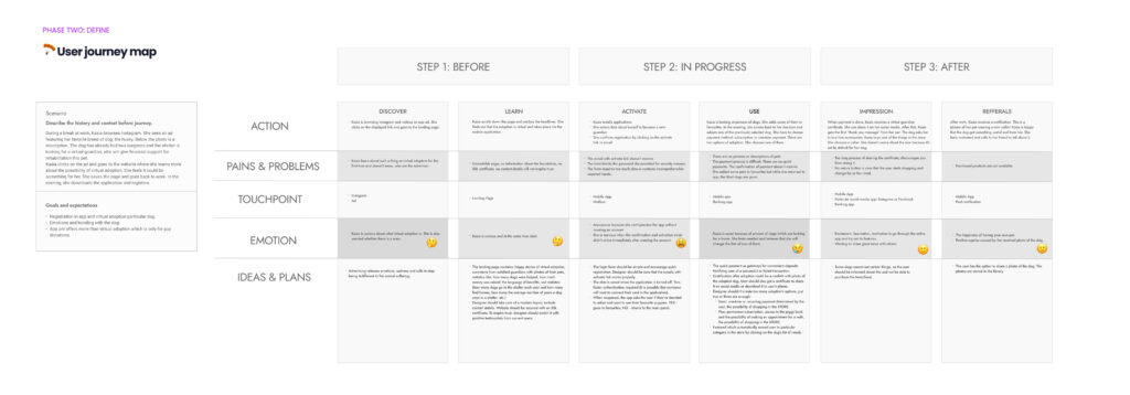
The purpose of creating a customer journey map was to put me in user shoes, define and represent the different touchpoints that characterize user interaction with the app as well as describe possible scenarios and map user experience while using the prototype. Analyzing CJM helped me to uncover more defects so I could iterate the prototype design and finally determine whether it was feasible to move forward with the wireframes.
🤖Lo-fidelity mocups
More in Figma at the bottom of the page.
🎨Style guide
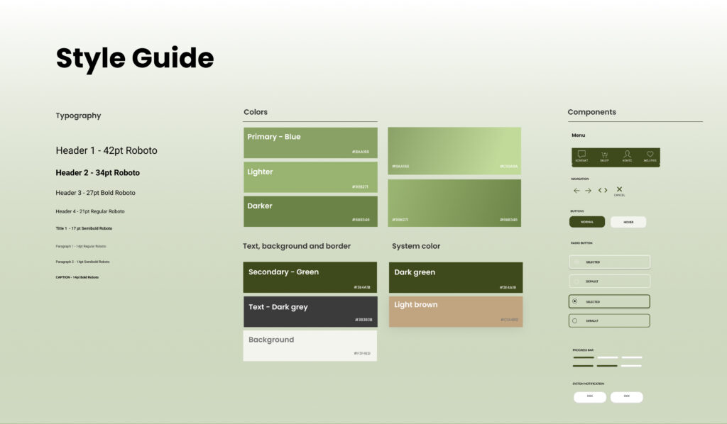
To make sure that every visual element I’ll produce is consistent, I created a style guide. After I made several design propositions and discussed them with potential users, I chose the cleanest design proposition and created a style guide based on that idea.
📱Hi-Fidelity Mockups
After several iterations of the lo-fi wireframes and working around the general look and feel for the application, I created the Med-Fi designs that I used to make the prototype to evaluate design ideas.
💭Conclusions
If you see this text, it means I’m not done yet. Please, continue in Figma 🙂